Original Typography Face
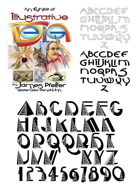
At upper middle is the original concept wherein the word “DeSign” was illustrated in a methodology course which caused the inspiration to do an original type face design in a typography course while I was working on a Master’s Degree from Savannah College of Art and Design. I was able to relate the two courses together for a common purpose at the time.
Currently there are four projects wherein I can take the project further and test letter relationships to each other as they are used together.
“zuEfrischen 1” on Panel 4 is the primary use at the present in an ongoing process of bringing back a really rare, old car from the dead of a rusty old hulk. The exhibition poster on Panel 2 uses the face most prolifically with several lines of type the are beginning to show how the letters relate to each other on longer lines of type. When I feel that the design meets typography design standards the ultimate goal is to attempt to register and market it with a type house.