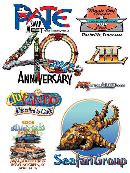
Logo Design
 In 1972 several gentlemen in and around Texas who belonged to various car clubs decided to start a “swap meet” wherein people interested in automobile restoration could meet together and buy, sell or trade old car parts. The swap meet became known as the Pate Swap Meet and it was held in an open field on the property owned by Mr. Aggie Pate who also built the Pate Museum of Transportation southwest of Fort Worth, TX... an ideal spot with a bit of an attraction... and it has been successful to present day.
In 1998 the location had to be changed finally relocating at the Texas Raceway just north of Fort Worth. After several years of rebuilding, the Pate Swap Meet Association decided that a new marketing effort should be implemented along with celebrating the 40th anniversary of formation. Having very little in the way of logo identification, it was decided to start re-branding and the images on this page present a new direction for branding with a new Logo in 2012 using two colors and black in the color version which will be the primary graphic for overall identification, letterhead, business cards and more.
The new logo is designed to show that the Pate Swap Meet is progressing beyond being just a swap meet wherein a large number of old car enthusiasts and “car guy” people get together to buy, sell or trade old car parts, junkers, signs, etc. The new logo is designed to be a strong marketing tool with visual impact that will always be associated with the event, to encompass a broad spectrum of the antique car market showing that the Swap Meet is an umbrella over all aspects of the market located in Texas and totally an American institution denoted by the uses of red, white and blue colors. From experience, the word “Pate” has become the identification word for the event and so emphasis was put on it to be the dominant graphic... ”You going to ‘Pate’ this year?” “Yeah, I wouldn’t miss ‘Pate’ for all the world!.”
Design ideas for the 40th Anniversary graphics explore different approaches one of which will work... some more successfully than others... toward celebrating this milestone for the Swap Meet. These ideas are presented to show the graphic direction taken primarily for stitched hats & shirts and some of the many possibilities available for several other applications... ceramic coffee mugs and possibly mouse pads, coasters and windshield decals to name a few.
Some Logos reflect strong design and a small amount of illustration. They are all working projects purposefully creating graphic impact that pops out when observed:
P&A Import Services is a family owned Porsche&Audi automobile service center in Nashville, TN limited to not being able to say or picture either a Porsche or Audi as they are not an officially recognized service center.
SeafariGroup is a diving school in Austin, TX traveling world wide.
Pate is a variation of the Pate Swap Meet logo used on a textile design for 2011 prior to the currently redesigned, new logo.
Pate is a variation of the Pate Swap Meet logo used on a textile design for 2011 prior to the currently redesigned, new logo.
ArtoftheAuto.com is this author’s current logo which reflects the web site used to present a portfolio, giclee’ automotive oriented fine art prints and a personal biography.
zuEfrischen 1 is the name given to a 1948 two door Lincoln by the builder of an automobile currently being modified as a prototype, one off version that is to become the primary pattern to reproducing several copies. It was specified to use a simple, yet distinctive type face design resulting in using an original face created by this author that had no prior commercially use thus giving it a very nice claim to originality for a project that is bringing a somewhat hard to find, basket case, rusted out old body back from the dead, which is what the name means in German. The name is supposed to grace the grill in chrome, glove box cover in brass or copper on the dash, the kick plate at the door and a sewn area between the back, bucket seats. And more uses for the design is to come.
